Installation & Setup
Enough with the theory!
Here we would like to give some real examples of how to configure and implement the datagrid. Using the skygrid demo-app, we would like to show and explain the datagrid step by step, with concrete code examples.
Installation
info
This is a developer preview which currently only runs on UNIX based systems! We recommend to use Node > v14.x
and >= v16.x. If you use Node 14.x then install via npm i. For Node 16.x use npm i -f.
Currently the datagrid is only usable and testable in the rescoped repository in the skygrid demo-app, with preconfigured test data. As soon as we are out of developer-preview, which will probably happen beginning of 2023 Q1, the rescoped datagrid can be consumed via NPM.
Install like below
git clone github/avodaq/rescoped.git
cd rescoped
npm install
npx nx serve skygrid
Markup
info
In order to continuously achieve good performance, it is essential to use the cdk-virtual-scroll-viewport component.
Once we are in beta, this component will only be needed for more than 1000 rows.
Impelement Markup
Impelement the Markup like shown below and use <ng-container> to build your datagrid.
<cdk-virtual-scroll-viewport [tvsItemSize]="38">
    <mat-table
      mat-datagrid
      #matdatagrid="matdatagrid"
      [itemRules]="itemRules"
      [dataSource]="dataSource"
      [density]="'xs'"
      [rowHover]="true"
      [collapsedRows]="true"
      [cellGap]="2"
      [rowGrouping]="false"
      class="mat-table-gap-2 input-density-xs rows-collapsed rows-grouping hide-divider rows-hover"
    >
      <ng-container matColumnDef="date">
        <mat-header-cell *matHeaderCellDef>
          <span>Date</span>
        </mat-header-cell>
        <mat-cell *matCellDef="let skyItem; type: dataSource">
          <mat-datagrid-input
            cdk-datagrid-edit
            [validator]="standardValidation"
            [item]="skyItem"
            [key]="'date'"
          ></mat-datagrid-input>
        </mat-cell>
      </ng-container>

            ...

      <mat-header-row *matHeaderRowDef="tableColumns; sticky: true"></mat-header-row>
      <mat-row
        cdk-datagrid-row
        *matRowDef="let skyItem; columns: tableColumns"
        [item]="skyItem"
      ></mat-row>
     </mat-table>
  </cdk-virtual-scroll-viewport>
TypeScript
Placeholder rule
1. Define columns
Define the columns as usual.
readonly tableColumns = ['date', 'flightNumber', 'status', 'origin', 'destination'];
2. Create data model
Create your data model, but wrap it with the setItemPayload() function.
import { setItemPayload } from '@rescoped/components/datagrid';

const skyGridData: SkyGridData[] = [
  setItemPayload(
    {
      date: '15.10.2022',
      flightNumber: 'SF-2042',
      status: 'Boarding',
      origin: 'Munich',
      destination: 'Rome',
    },
    { actionType: 'single-row' },
  ),
  setItemPayload(
    {
      date: '15.10.2022',
      flightNumber: 'CW-2931',
      status: 'Boarding',
      origin: 'Hamburg',
      destination: 'Antalya',
    },
    { actionType: 'single-row' },
  ),
  setItemPayload(
    {
      date: '15.10.2022',
      flightNumber: 'AA-1274',
      status: '',
      origin: 'Hamburg',
      destination: 'Madrid',
    },
    { actionType: 'single-row' },
  ),

  ...

];
tip
If you are interested in ways to initialize data on ngOnInit, please have a look at the Angular-Material table examples and Angular-Material table API.
3. Define rules
Create your data model, but wrap it with the setItemPayload() function.
Define your placeholder rules by passing a string.
const itemRules: GlobalRules<SkyGridData> = {
'single-row': {
overrides: {
flightNumber: {
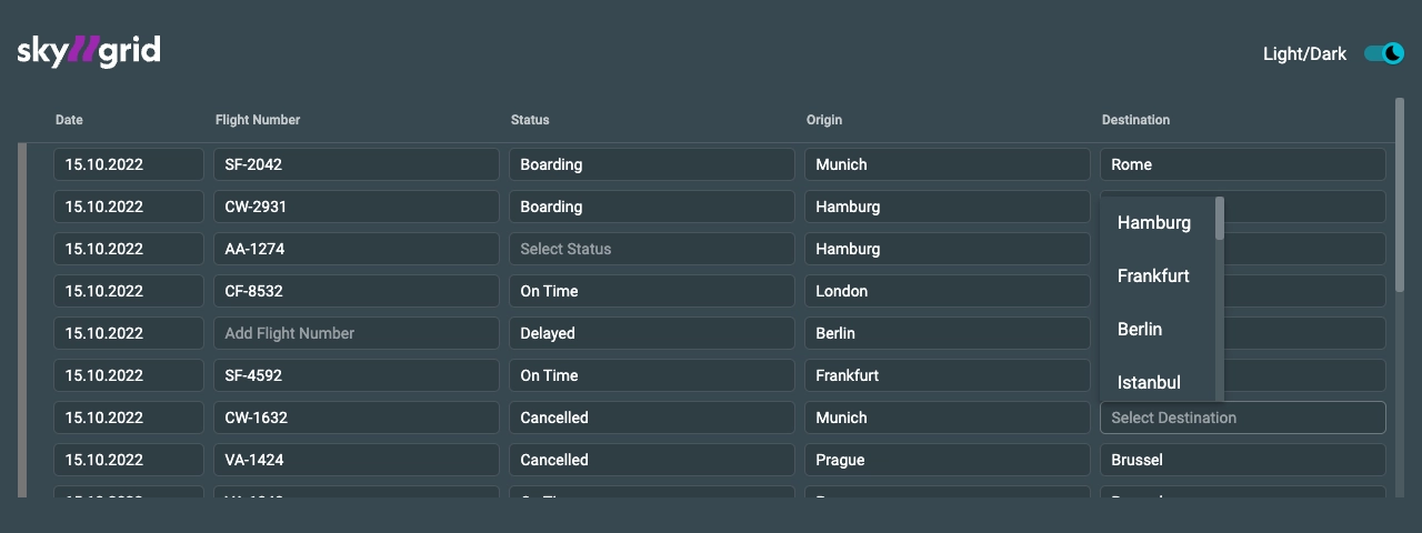
placeholder: 'Add Flight Number',
},
status: {
placeholder: 'Select Status',
},
destination: {
placeholder: 'Select Destination',
},
},
},
};
4. Voilà
Run the project with npx nx run skygrid:serve. Voilà, you just created your first rescoped datagrid, and you
have access to its cell placeholders!
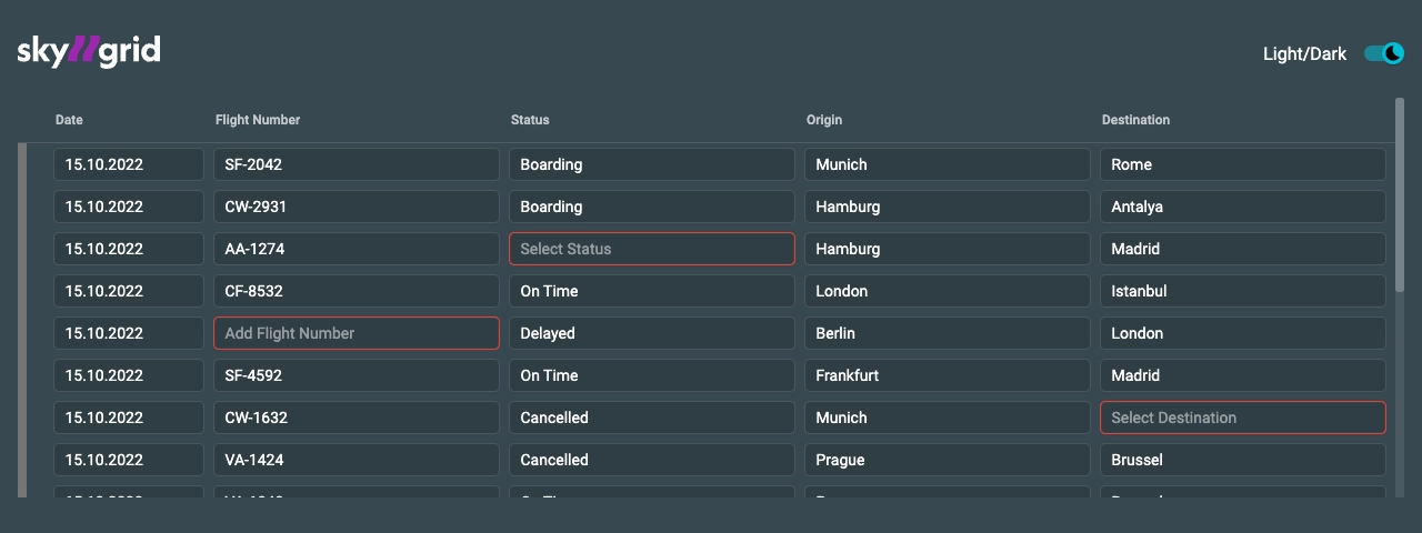
Validation rule
Of course, we want to give the user immediate feedback when he enters a value, so that he can always be sure that he is doing the right thing.
1. Configure validation
Configure the validation rules and set validationCode and validationMessage.
const itemRules: GlobalRules<SkyGridData> = {
    'single-row': {
      validate: true, // add validate to your rules
      overrides: {
      ...
      },
    },
};
readonly flightNumberValidation: DatagridValidation = {
  validator: [
    Validators.required({
      validationCode: 'REQUIRED_FIELD',
      validationMessage: 'Required field',
    }),
    Validators.pattern(/[A-Z]{2}-[0-9]{4}/, {
      validationCode: 'INVALID_FLIGHT_NUMBER_FORMAT',
      validationMessage: 'Invalid flight number format',
    }),
  ],
};
2. Implement markup
Implement the markup and bind to the custom [validator] input.
<ng-container matColumnDef="flightNumber">
  <mat-header-cell *matHeaderCellDef>
    <span>Flight Number</span>
  </mat-header-cell>
  <mat-cell *matCellDef="let skyItem; type: dataSource">
    <mat-datagrid-input
      cdk-datagrid-edit
      [validator]="flightNumberValidation"
      [item]="skyItem"
      [key]="'flightNumber'"
    ></mat-datagrid-input>
  </mat-cell>
</ng-container>
3. Voilà
Your datagrid cells get validated, based on your defined validation rules, and you have the option to respond
with an error if the corresponding rule does not apply.
Global-row & group-row
We want to create a group of rows in our datagrid and configure it in a user-friendly way! And we want that the
entered value in a row should be applied to each cell of a column of the entire datagrid or each cell of a
corresponding group. After hitting enter, the entered value should disappear from the global-row & group-row
cell, so it is quickly ready for use again. To do this, we need to do two things here:
1. Define group
- 1. To create a group, we give the
group-rowand all associated `single-rowsagroupId. Here, for simplicity, 1234. ThegroupIdis always of typenumber. - 2. We have to define the
group-rowas parent by settingparent: true. For the beta, it is planned to makeparent: trueoptional.
We extend the previous configuration by these global rules: actionType, parent and groupId.
const skyGridData: SkyGridData[] = [
  setItemPayload(<SkyGridData>{}, { actionType: 'global-row' }),
  setItemPayload(<SkyGridData>{ date: '15.10.2022' }, { actionType: 'group-row', parent: true, groupId: 1 }),
  setItemPayload(
    {
      ...
    },
    { actionType: 'single-row', groupId: 1 }, // every single-row has the same groupId as its parent
  ),
  setItemPayload(
    {
      ...
    },
    { actionType: 'single-row', groupId: 1 },
  ),
  setItemPayload(
    {
      ...
    },
    { actionType: 'single-row', groupId: 1 },
  ),

  ...

];
2. Implement batch-edit behavior
Define your global rules and group rules. Set validate: false to delete the value of the global-row
and group-row from the cell, after hitting enter.
const itemRules: GlobalRules<SkyGridData> = {
  ‘global-row: {
    validate: false,
  },
  ‘group-row’: {
    validate: false,
  },
  'single-row': {
    ...
  },
};
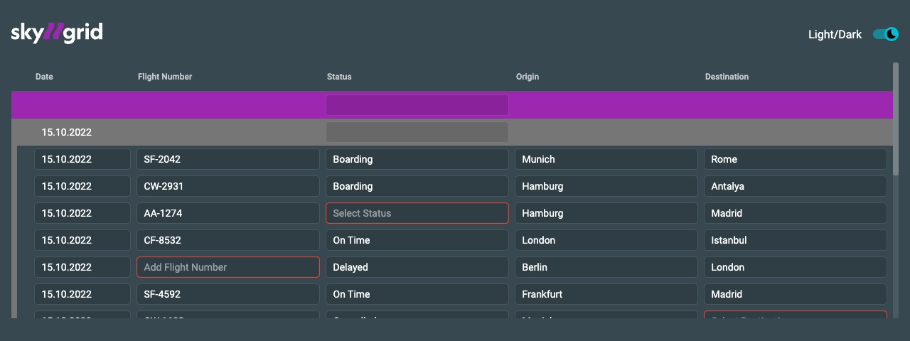
3. The result
The blue row is the global-row, the orange is the group-row. Every change in a cell of the global-row is
transferred to every single-row of all following groups. Every change in a group-row is transferred to
every single-row of the specific group with the groupId 1234.
You can see: We have entered the value 2.111 in the group-row Weight cell and the single-rows have
adapted this value. Since the last two rows have a different groupId, they have not taken the new value.
Collapse groups
In most cases, we want to open or close a group, just like an accordion component. Typically, this functionality
is achieved by applying and removing CSS. But we want to keep the performance of the datagrid high, even when
scaled up to large data sets. Therefore, we decided to remove the single-rows of a corresponding group from the
DOM, instead of simply hiding them with CSS. To implement this behavior, we have developed
the MatDatagridCollapseComponent.
1. Modify rules
Here, we set render: false to make the cell only render a string and stop behaving like an input field.
const itemRules: GlobalRules<SkyGridData> = {
  'single-row': {
      overrides: {
        'group-by-date': {
           render: false,
        },
        ...
     },
  },
};
[link-to-code]
2. Implement Collapse
We use the action property to import the MatDatagridCollapseComponent into the datagrid and are able
to use componentPosition to configure where in the DOM this component should be rendered. Use before, after
and override.
import { MatDatagridCollapseComponent, setItemPayload } from '@rescoped/components/datagrid';

const group1 = setItemPayload(<SkyGridData>{ date: '15.10.2022' });

const skyGridData: SkyGridData[] = [
  setItemPayload(<SkyGridData>{}, { actionType: 'global-row' }),
  setItemPayload(group1, {
    actionType: 'group-edit',
    parent: true,
    groupId: 1,
    rules: {
      overrides: {
        date: {
          action: {
            componentType: MatDatagridCollapseComponent,
            componentPosition: 'before',
            data: {
              item: setItemPayload(<SkyGridData>{ date: '15.10.2022' }),
            },
          },
        },
      },
    },
  }),
  ...
];
[link-to-code]
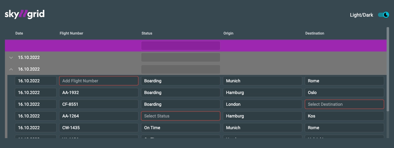
3. Voilà
Here you can see the chevron icon at the beginning of the orange group-row. This is the
MatDatagridCollapseComponent. If you click on it, the corresponding single-rows of this group will be
removed from the DOM and by clicking again re-rendered into the DOM.
Styling
The developer-preview comes with predefined stylesheet. As soon as we are out of the developer-preview, we will provide more description for this section.
In the meantime, please have a look at our Theming guide